Product Detailed Description
Color as Brand Signature
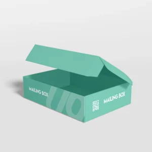
Standard shipping communicates through size and shape. Colored mailer boxes communicate through immediate visual association — brand recognition, emotional response, category positioning. Before logo visibility, before content revelation, color establishes relationship.
We manufacture colored mailer boxes through multiple methods achieving spectrum precision from subtle tint to saturated statement.
Color Achievement Methods
Dyed Fiber Board
Paperboard manufactured with color throughout fiber structure. Edge exposure reveals consistent hue. Scuffing or wear does not expose contrasting substrate.
-
Standard palette — Black, red, blue, green, yellow with saturation variants
-
Custom dye matching — Pantone specification, batch consistency, minimum order requirements
-
Recycled content integration — Color achievement with post consumer waste fiber
Colored Laminate
White or natural substrate with colored film application. Surface color with edge exposure of base material. Economical for volume, consistent saturation, broad color gamut.
Surface Print Saturation
White substrate with heavy ink coverage achieving color appearance. Edge remains white. Most economical, least premium, suitable for volume applications without edge visibility concern.
Through Color Coating
Applied coating penetrating fiber surface, creating color layer resistant to surface wear. Intermediate between surface print and dyed fiber.
Standard Color Applications
Black
Sophistication, drama, premium positioning, tech association, fashion forward. Maximum contrast with metallic foil, white print, or bright accent.
Red
Energy, urgency, appetite, celebration, warning. High visibility, immediate arrest, emotional intensity.
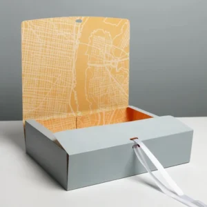
Blue
Trust, calm, corporate, masculine, aquatic. Broad demographic acceptance, professional association, stability suggestion.
Green
Nature, health, sustainability, growth, finance. Environmental positioning, organic association, prosperity suggestion.
Yellow
Optimism, attention, caution, warmth, creativity. Maximum visibility, cheerful association, energy communication.
Specialty Hues
-
Purple — Luxury, creativity, spirituality
-
Orange — Enthusiasm, value, autumn, warmth
-
Pink — Feminine, playful, breast cancer awareness, celebration
-
Brown — Earthy, rustic, chocolate, reliability
Print and Finish on Color
Tone on Tone
Slightly darker or lighter shade of same hue. Subtle, sophisticated, texture focused. Embossing creates interest without color contrast.
Metallic Contrast
Gold, silver, copper, holographic foil on colored ground. Luxury elevation, celebration association, premium positioning.
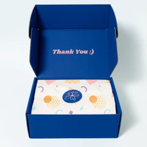
White Contrast
Clean, crisp, modern. White ink or labels on saturated color. High readability, contemporary aesthetic, graphic impact.
Black Contrast
Dramatic, editorial, strong. Black print on bright color. Bold statement, maximum legibility, graphic power.
Category and Application
Brand Color Systems
Corporate palette extension to shipping. Recognition reinforcement, system coherence, professional presentation.
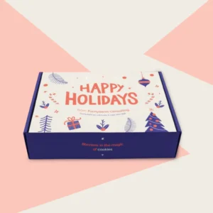
Seasonal Theming
Holiday colors, summer brights, autumn warmth, spring pastels. Timely relevance, celebration participation, collection coordination.