Product Detailed Description
The Semiotics of Pink
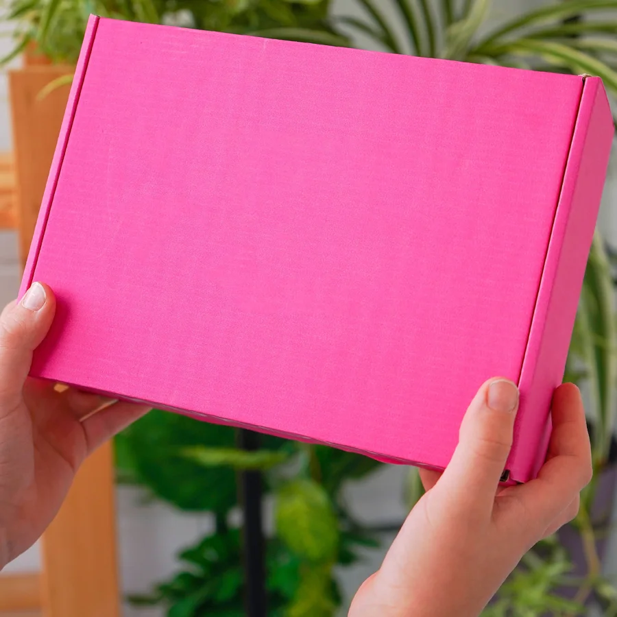
Color functions as communication without words. Pink carries specific cultural loading — nurturing, feminine, celebratory, health awareness. Pink mailer boxes deploy this association immediately upon visual contact, before logo recognition, before content revelation.
We manufacture pink mailer boxes through material or surface methods, achieving spectrum precision from subtle suggestion to saturated statement.
Color Achievement Methods
Colored Board Stock
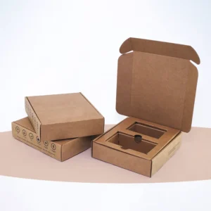
Paperboard dyed through fiber during formation. Color extends through entire material thickness. Edges reveal consistent hue. Scuffing or wear does not expose contrasting substrate.
-
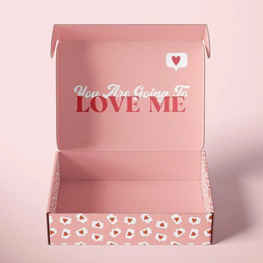
Blush — Near neutral, warm undertone, sophisticated restraint
-
Rose — Mid saturation, classic association, versatile application
-
Bubblegum — High saturation, playful energy, youth positioning
-
Fuchsia — Maximum impact, trend forward, statement making
Surface Printed Pink
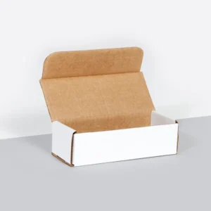
White or natural substrate with pink ink coverage. Economical for volume. Color consistency across large runs. Edge exposure of base color may occur with wear.
Laminated Pink
Colored film applied to substrate surface. Maximum saturation, gloss or matte finish options, superior scuff resistance. Premium positioning appropriate.
Category Applications
Beauty and Cosmetics
Pink dominates skincare, haircare, feminine hygiene packaging. Color alignment with product category expectations. Soft touch lamination over pink board creates inviting handling.
Wellness and Self Care
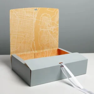
Association with gentle care, recovery, personal time. Meditation products, bath items, comfort positioning. Blush and rose tones suggest sophistication, intentionality.
Celebration and Gifting
Baby showers, bridal events, birthday recognition. Pink signals occasion without explicit messaging. Gift ready presentation eliminating secondary wrapping.
Health Awareness
Breast cancer campaign alignment. October releases, fundraising products, survivor recognition. Specific pink Pantone associations with established awareness organizations.
Youth and Playful Positioning
Children's products, candy, toys, accessories. Bubblegum and fuchsia energy suggesting fun, imagination, lack of seriousness.
Print and Accent Strategies
Tone on Tone
Pink board with slightly darker or lighter pink print. Subtle, sophisticated, texture focused. Embossing and debossing create interest without color contrast.
Metallic Contrast
Gold foil stamping on pink ground. Silver for cool pink variants. Copper for rose tones. Luxury elevation through material juxtaposition.
White Contrast
Clean, crisp, modern. White ink or labels on pink substrate. High readability, contemporary aesthetic, graphic impact.
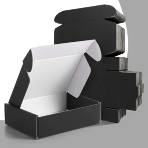
Black Contrast
Dramatic, editorial, fashion forward. Black print on saturated pink. Bold statement, trend association, maximum visual arrest.